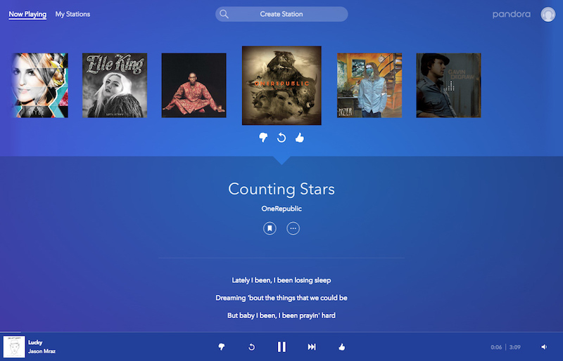
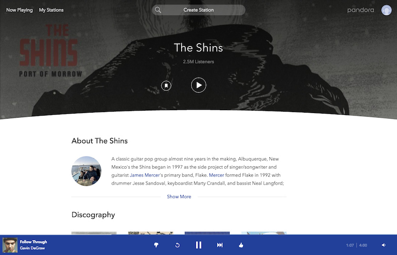
The changes begin with the music player on Pandora’s web platform, which is now a fixed bar at the bottom of the screen, ensuring that users will “never lose sight” of the currently playing track. Because of this shift, album artwork is at the center of the screen and provides prompts to artist information like tour dates, lyrics, bios, and more. The flat blue aesthetics of the site also now closely mirror that of the company’s mobile app and its logo.

Pandora has also streamlined a few navigation features when users create and organize stations, look at their favorite tracks, and use playback controls. The company said that “the updated features across the platform allow you to easily control your listening experience.”

Listeners on Pandora Plus can use the replay button to restart a song from the beginning, or even jump back in the current listening session and find an old track to replay. A skip option will also let them get to the next song quicker, as well. The ad-supported version of Pandora on the web supports these features too, but in a limited capacity. Whenever users on the free tier run out of skips or want to listen to a track again, the company said that they can “watch a video ad to get those extra features for added control” over the service.

Much like the app rebranding in October, the slight shift in Pandora’s web platform today is setting up the launch of the company’s impending on-demand music listening service, which CEO Tim Westergren has confirmed will arrive “later this year.” The service — which is believed to cost $9.99/month — will enter the music streaming race as an Apple Music and Spotify rival, with features expected of such a competitor, including on-demand music listening, playlist creation, radio access, and more.


