Hardware
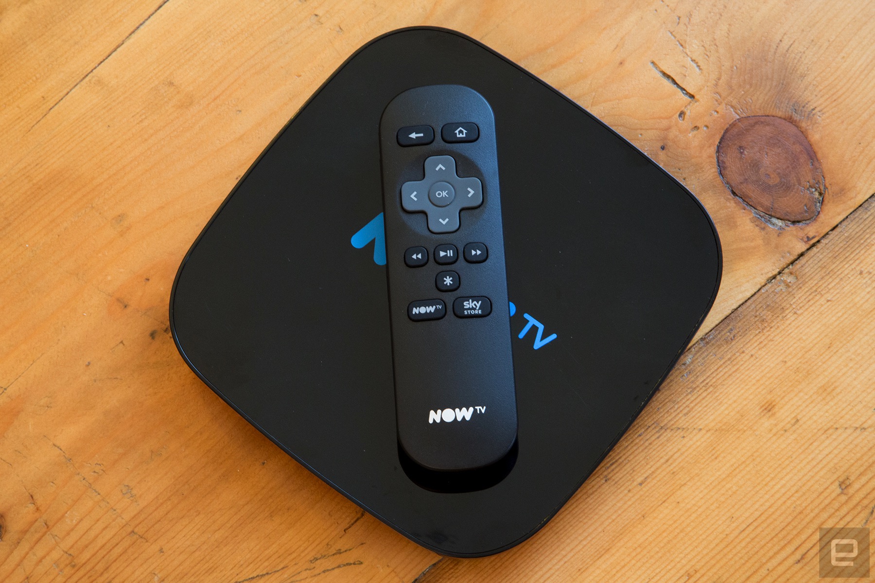
The Smart Box, like most streaming hardware, is a black slab designed to fade into the back of your entertainment center. It’s a flat, squarish puck measuring 165mm by 165mm on top, which is about the same size as Amazon’s Fire TV and Google’s Nexus Player. Given its low height (20.5mm), I found it simple to slide the box in between a few dust-covered consoles beneath my TV.
Around the back you’ll find a handful of ports for power, HDMI, microSD cards and Ethernet. There’s also the aforementioned coaxial port, however you won’t find a TV cable in the box. If you just have a port in the wall, rather than a permanent cable trailing into the room, you’ll need to dash to somewhere like Maplins or buy one online. (I moved house recently and had to do just this.) It feels like an oversight on Sky’s part, even if most people probably have one kicking around in a cupboard.
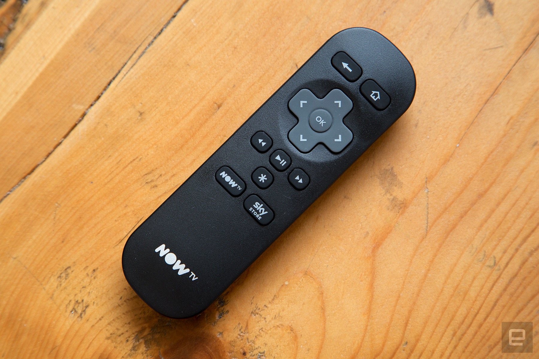
The Smart Box remote is a tiny piece of kit with just a few buttons. A directional pad sits in the center, with back and home options up top. Three navigational arrows (rewind, pause/play and fast-forward) sit underneath, followed by an options button and two shortcuts for Now TV and the Sky Store. There’s no search button and no microphone, meaning you can’t bark for “action movies starring Tom Cruise” like you would with the latest Apple TV. It’s a serviceable remote, but could use a numerical keypad — scrolling through more than 60 TV channels gets pretty tiresome with bog-standard arrow buttons.
On-demand
The Smart Box feels like three separate experiences stitched together with gaffa tape. The first is the Roku-powered interface, dominated by a six-option menu that sits on the left-hand side. The “Home” is your starting point, with a grid of square thumbnails highlighting TV shows and movies you might like to watch. The first suggestion is always your last live channel, which provides a quick shortcut into free-to-air television.
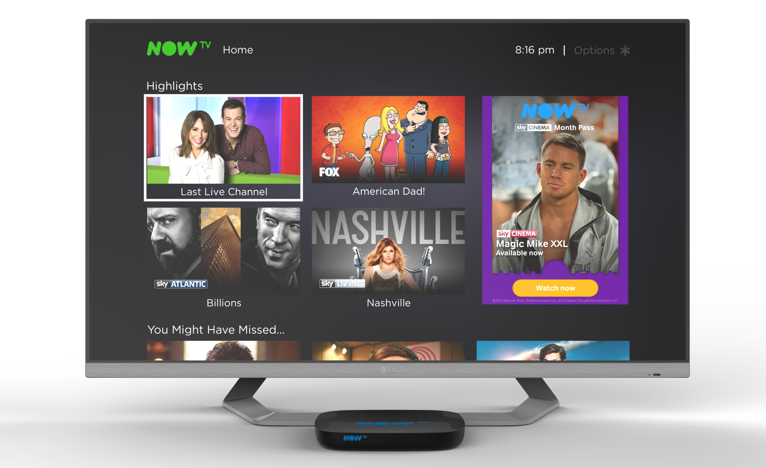
There are several sub-categories present on the home screen, such as “highlights” and what “you might have missed.” I rarely use these, however, because while Sky suggests programming from a few different places, including BBC iPlayer and the ITV Hub, there’s no personalisation. The picks are seemingly based on what’s popular at the moment, so you’ll see a lot of I’m a Celebrity Get Me Out of Here and Teen Mom UK. Yuck. Occasionally I’ll stumble on a gem — a nature documentary by the BBC, or a new movie added to the Sky Store. But these moments are rare and I’ve long stopped looking beyond the first row of suggested viewing.
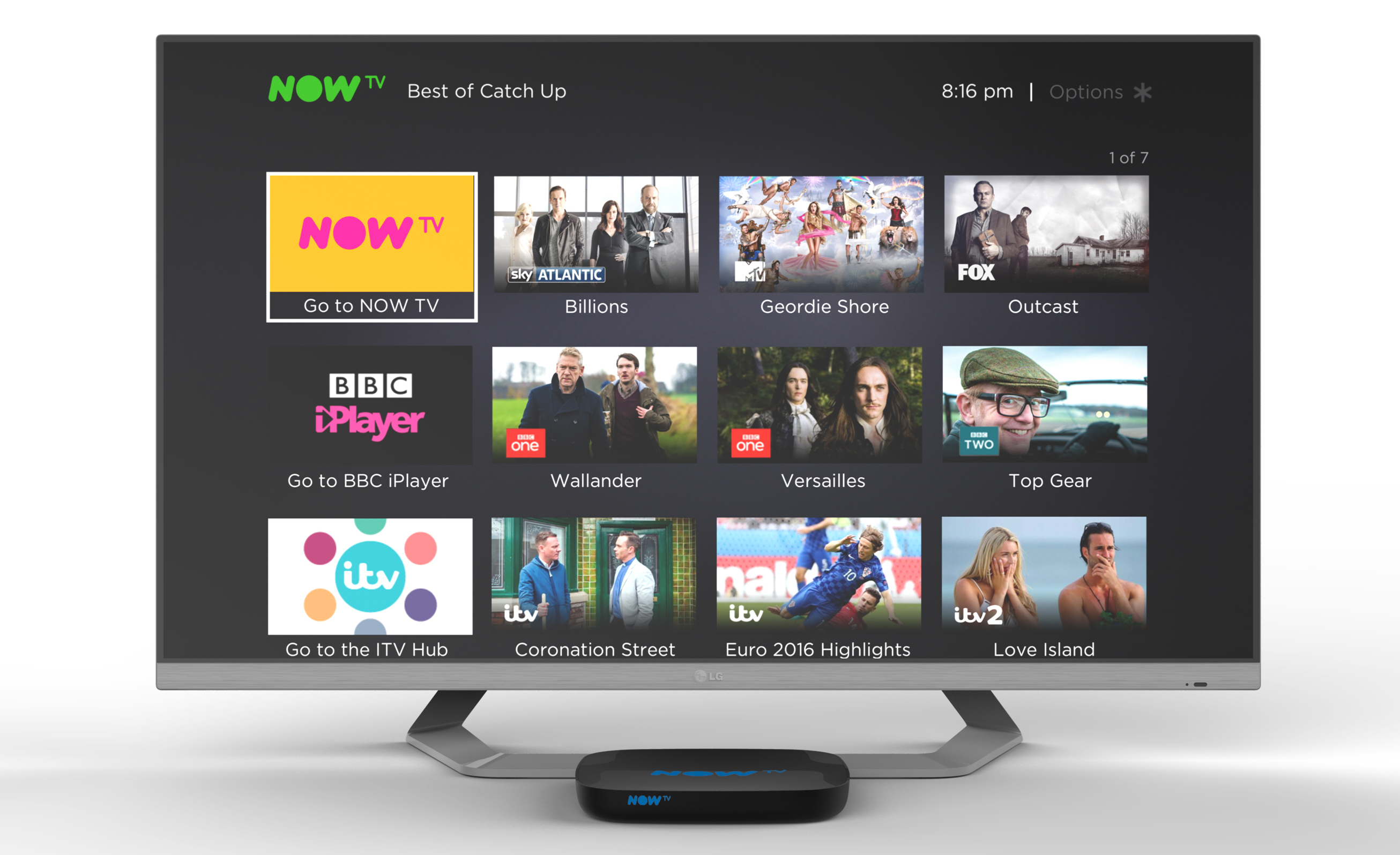
One step down from Home is the “Best of Catch-up,” another grid showcasing VOD content. Now TV sits at the top, followed by BBC iPlayer, the ITV Hub, All 4 and Demand 5. A row is dedicated to each service, with a few programme choices and a shortcut to launch the app itself. It’s a functional, if bland interface which I use only to launch apps that I know have a particular show or movie I want to watch.
Continue scrolling through the core menu and you’ll find “My Apps,” which, well, should be self-explanatory. Now TV has a dedicated button on the remote, so I only used this menu to launch Crunchyroll, Vimeo and TED, which are available to download through the App Store. These applications — which are the same as those found on regular Roku players — vary wildly in quality. Each has a different design and interface, and it’s clear some are updated more frequently than others.
Then there’s Now TV. With “Home” and “Best of Catch-up,” Sky makes it seem like everything is just a click away. Tap once and your show or movie will start immediately. But that’s not the case — Now TV is actually a separate app, with its own menu hugging the left-hand side of the screen. In the context of the Smart Box, it’s an interface inside an interface. Sure, the two are visually consistent, but it’s wildly disorienting when you drill down into the Now TV app and then hit the “Home” button on the remote, only to find yourself in the similar but ultimately different Roku menu.
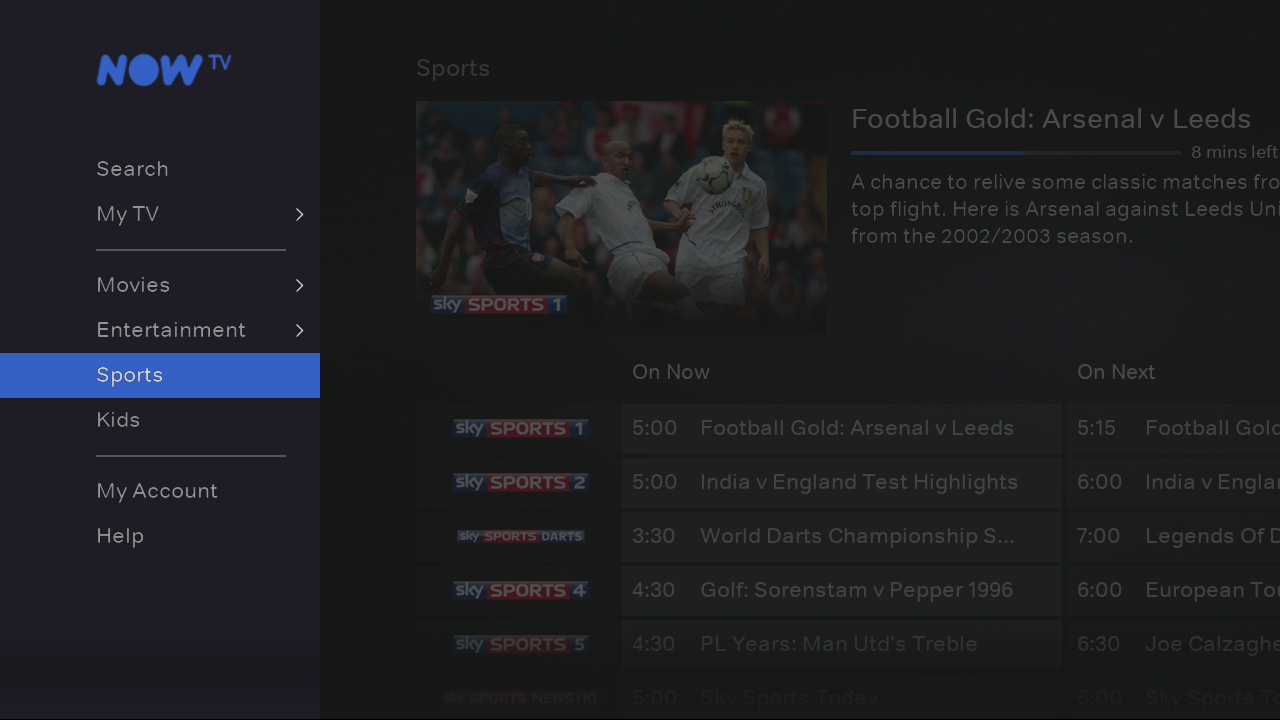
The Now TV app is perfectly functional on its own. That’s because it’s the same app you’ll find on other streaming devices, such as the PlayStation 4. Clearly, Sky has put a lot of time and money into its development. The problem is that it’s not cohesive with the rest of the Smart Box experience. It’s a silo — a brilliant one, but a silo nonetheless. As I mentioned earlier, this makes it feel like the two have been virtually gaffa-taped together.
Live TV
While I mostly stream my favourite TV shows, I still use free-to-air TV channels for sports and political events. International football matches, parliamentary debates — I could always stream these live, but there’s a convenience to doing it the old-fashioned way. The experience is mostly stellar on the Smart Box, thanks to three different types of navigation. You can tap up and down on the remote, which lets you scan available channels as a slim sliver at the bottom of the screen. It’s useful if you want to keep the current channel in view, while seeing what else is available at the time.
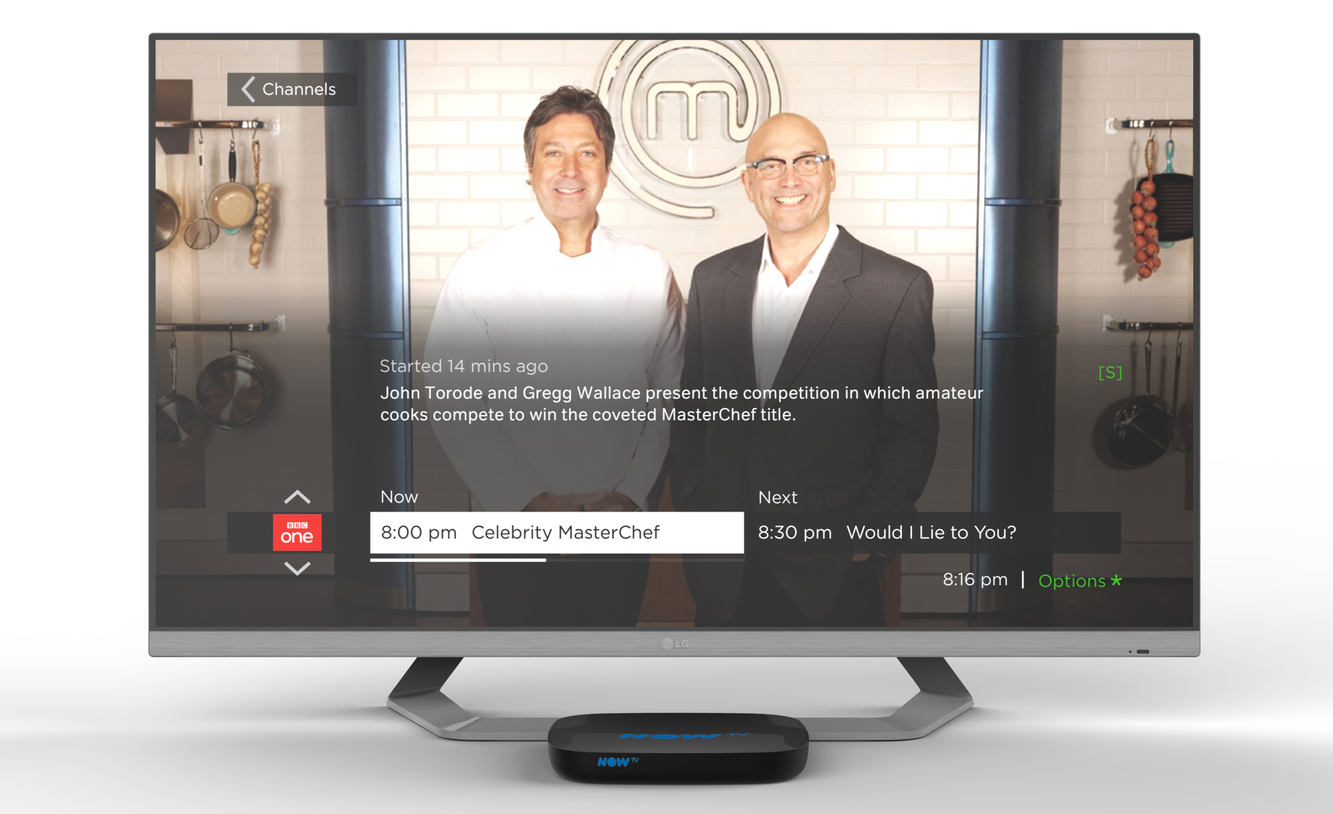
Alternatively, you can tap left on the D-pad to activate a larger TV guide. The expanded feature takes up half of the screen and lists eight channels simultaneously. You can scroll through with the remote; a thin white bar appears underneath each show, denoting how long is left until the next programme starts. Finally, you can head back into the Roku interface and select the dedicated ‘TV Guide’ option. I wouldn’t recommend it, however, as it takes a second to load and doesn’t offer too much more information. Still, it’s there if you really need it.
You can’t record with the Smart Box, but you can rewind. Sky lets you scrub back to the moment when you first selected the channel — 30 minutes is the maximum, however — and fast forward once you’re done. It works well, although a “jump to live” shortcut would have been nice.
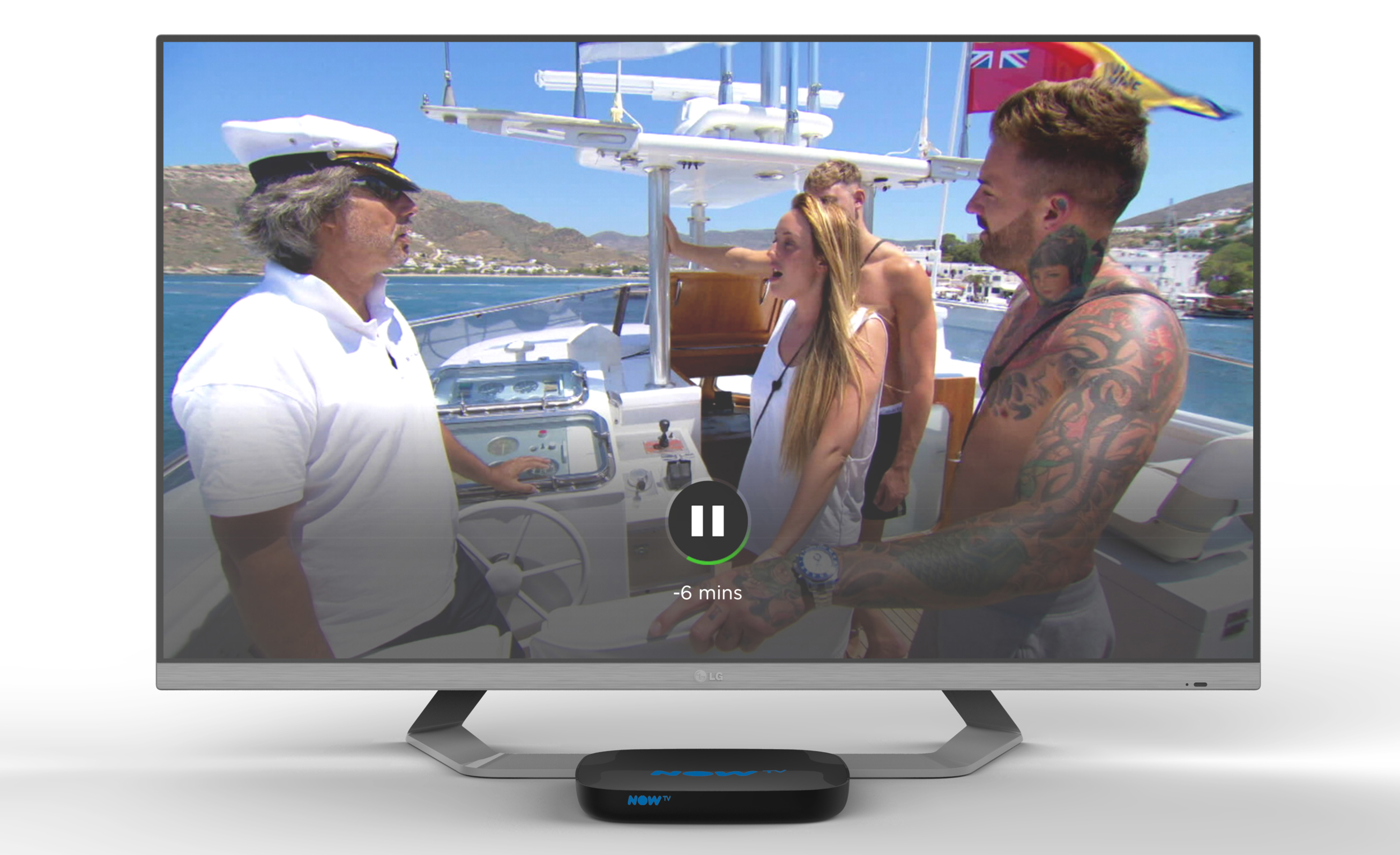
A Now TV subscription will grant you access to some of Sky’s premium TV channels; the Movies pass, for instance, lets you livestream everything related to Sky Cinema. Annoyingly, all the live channels are listed in a TV guide that’s separate to the free-to-air TV channels. That’s because the functionality is contained within the Now TV app, rather than the top-level Roku-powered interface. These isolated experiences add to the overall feeling of disharmony. They’re strong on their own, but rarely work together in a way that feels smart or cohesive.
Content
Unsurprisingly, the Smart Box gets better as you subscribe to more of its monthly passes. If you have all four, you’ll find an excellent range of sport, movies and TV shows to dig into. But that’s an expensive way to go, and almost defeats the purpose of avoiding a Sky TV subscription. I normally have one or two active — I subscribed to the Entertainment Pass while Game of Thrones was airing, then activated the Sports pass once the Premier League was back in full swing. Now, I’m rinsing the Movies pass in the run up to Christmas.
The problem is that there’s no way to filter what’s shown in the top-level interface. You’ll always see suggestions tied to the Entertainment, Movies and Sports passes, regardless of which ones you have access to. It’s an obvious ploy to tease more money out of you — the hope being that you’ll see a TV show you want to watch and pay for the relevant pass out of convenience. As a stubborn customer, however, I found myself irritated by the wealth of irrelevant content. I only want to see what I have access too, otherwise the process of deciding what to watch is extended unnecessarily.
While Now TV is decent, it doesn’t make up for the absence of Netflix and Prime Video. These are huge services with vast libraries. I’m signed up to both and enjoy some of their shows immensely, which means I always need another box connected to my TV. I don’t mind switching — my PS4 is always plugged in — but it defeats the purpose of having a single TV and streaming box. Sky’s device is supposed to be a silver bullet solution, handling free-to-air TV and streaming with grace. If you need another box for Netflix and Amazon, you might as well use it for every streaming service, including Now TV, which is available as an app elsewhere.
Wrap up
The Smart Box, despite its navigational niggles, is a capable device. If you mostly watch free-to-air TV, but want to compliment it with a streaming service or two, this is a solid option. It’s fast and responsive, with plenty of shows and movies to peruse. The problem is that it doesn’t accommodate people who have already signed up to Netflix and Prime Video. If you love these services and their libraries, you’ll need to switch inputs.
Sky’s strategy does make sense. Offering Netflix and Prime Video would mean risking its Now TV subscribers. Each service offers different content, and few people want to pay for them all at once. If the apps were available on the Smart Box, people would be compelled to at least try them and see how they fare against the Now TV passes. Sky built the hardware to push its streaming services and “Combo” TV, broadband and phone packages. Not to give customers a free or vastly discounted Roku. (It’s available for £40 on its own, or cheaper with one or more Now TV passes.)
If you want to stay platform agnostic, you might be better off with a regular Roku, or any other set-top streaming box. The compromise is the coaxial cable — most, like the new Apple TV, don’t support free-to-air channels — but in return, you’ll have better access to VOD services. The value of that trade-off will vary depending on your personal viewing habits, of course. If, like me, you’re addicted to BoJack Horseman, Stranger Things and Mr. Robot, you might want to consider another TV streamer, and relying on your TV (even if it has a crummy interface) for traditional channels.


