
The data-driven strategic planning framework consists of two parts; the first part is a sequence of tasks to be executed during data collection and presentation (see figure 2).
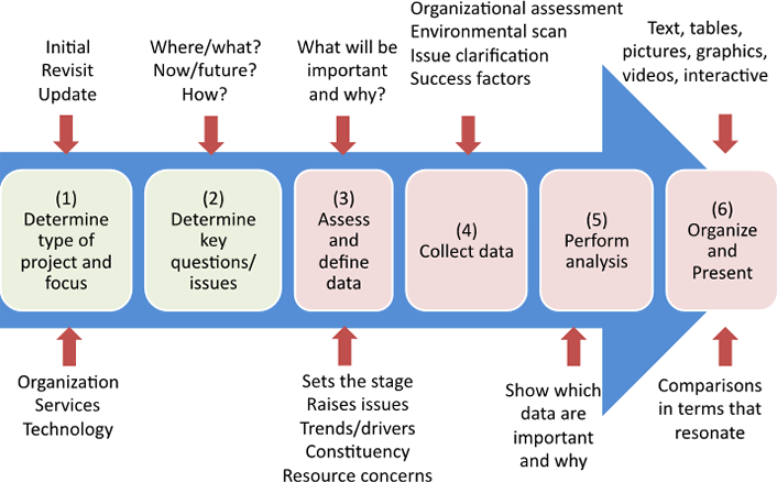
Figure 2. Data-driven IT strategic planning framework
Prior to assessing which data should be collected, the strategic planning committee should
- determine the strategic planning project’s type and focus (task 1 in figure 2), and
- determine key issues and questions arising from that focus (task 2).
Strategic planning projects range from totally new activities — such as an organization’s initial strategic plan — to relatively straightforward annual or biennial updates. In between are planning projects that revisit an existing strategic plan because something significant has changed; examples include a major shift in educational policy, such as focusing on online education for remote students or a shift from in-house to cloud computing. Such projects require more than a simple update and often need significant planning and data collection. The “Data Definition” sidebar discusses how to define the data you want to collect.
Data Definition
A fundamental consideration of data-driven strategic planning is ensuring that you carefully define each type of data you want to collect. If you cannot specifically define these data, you cannot appropriately analyze or draw inferences from them.
For example, data about applicants’ place of origin may seem clear, but do your data show where applicants were born, where they spent most of their lives, where they currently reside, or which high schools they attended? Data elements that are seemingly straightforward nevertheless require clear definition, as do data that may not come from a limited answer set. Imagine the difficulty in (and importance of) defining data elements about faculty needs for high-performance computing: How do you define need? (If it costs a million dollars an hour, is it still a need?) What is high performance? (Yesterday’s high-performance computers are hardly comparable to today’s.) And, for that matter, how do you define faculty?
Some projects have a narrow scope, such as those focusing on organizational resources and culture (severe budget cutbacks, for instance); specific IT service delivery (such as moving to the cloud); or a specific technology (incorporating artificial intelligence). Other projects have a broader scope that covers all areas. Understanding the project’s focus and scope is important in determining the types of data you need to collect to support it. If the project’s purpose is to examine specific issues, such as the impact of funding decreases, listing those issues can guide the initial data collection.
Once these two preliminary activities have been accomplished, the data-driven IT strategic planning framework focuses on the next four tasks in figure 2:
- Determining which data to collect to assess the current state, raise issues (including resource concerns and issues affecting a particular constituency), and identify trends and drivers that might affect the future (task 3)
- Developing a systematic approach to data collection (task 4)
- Analyzing the data (task 5)
- Organizing and presenting the data (task 6)
Supporting the entire strategic planning process means collecting data to help in each of the key strategic planning tasks: understanding the current state, understanding drivers of the future state, analyzing issues, and specifying the future state. It also means collecting data to address the issues of multiple constituencies, from students, faculty, researchers, and staff to alumni and applicants. Presenting data that ignore any of these tasks or stakeholders leaves the planning process open to question and perhaps criticism. Using the second part of the framework — the strategic planning data-organizing matrix described later — can help you track different data categories and purposes and expose areas where you might look for additional data.
Sometimes, strategic planning committee members do not have a complete picture of IT’s current state on campus. A principle source of these data is current service usage data, such as the number of computers on campus; Wi-Fi usage (by time, location, and type of user); the number of different software packages supported and used; the amount of space devoted to computing resources, including networks; the number of data elements in the data warehouse; and help desk interactions. The list of data items that demonstrate service usage can get quite long. These numbers can be augmented with financial data showing the total cost and the cost per unit for as many of these services as possible.
Current service usage data provide the volume picture; to understand the performance picture, you will need other data, such as outage statistics, and data forms, such as user satisfaction surveys. Surveys can be augmented with user testimonials (good and bad) and other qualitative and descriptive performance data.
If specific issues have already been identified (either by the IT organization or in the charge to the strategic planning team), you should collect data to support discussion and analysis of those issues. For example, if a significant cut in funding is expected in the next several years, you should present data that show the impact of cuts in various services, as well as whether cutting central IT budgets will simply result in additional departmental spending.
Presenting raw data, even well-defined raw data, is clearly less valuable than providing data with analysis. Analysis can take many forms, ranging from simple statistics to sophisticated factor analysis to qualitative discussions that introduce related data. Say, for example, that moving a certain type of research computing to centralized equipment will save $600,000 per year. Faculty may initially focus on the loss of control that would be a consequence of this move, but they might take a second look if you also give them data showing that $600,000 could support 10 additional graduate research assistants. Statistics and charts that bring in related data (such as the cost of a graduate research assistant) provide significant value.
Further, in the student demographics example above, even if you collect data on all the various types of origin, will you have information on student needs for IT training and capabilities when they arrive on campus? You may need to combine data on the high schools that students are coming from with socioeconomic and academic-standards data to get a more complete picture. Although this is a task that the strategic planning committee will not necessarily have the time or resources to take on, the strategic planning resource team should.
In deciding the type and level of analysis to perform, consider how data will be used (either in describing the current state, analyzing issues, or determining the future state or action). How you present the data analysis is equally important. Presenting data in contexts and forms that are meaningful to planning-process participants will help them understand the data’s strategic significance.
Graphs, charts, and other visual forms add value to tables of numbers (which should always be made available as well). It is the strategic planning resource team’s job to provide data in a variety of formats, without bias and without obscuring the original data (see the “Data Quality” sidebar). Members of the strategic planning committee also need to know why the resource team thinks the data are important, but they must make up their own minds as to whether they agree.
Data Quality
Data presented to decision makers should always be scrubbed to be as accurate and free of bias as possible (two measures of data quality). Although high-quality data don’t always lead to high-quality decisions, poor-quality data often lead to poor decisions. Data quality should be thoroughly addressed, particularly when the person or group collecting those data has a vested interest in the decisions that may be made using them.
Data quality is a question not just of whether the raw data are accurate or precise but also of whether they are appropriately presented in context and without bias. For example, you may have determined the accurate dollar amount for total IT expenditures for each of the past five years, but you need context to discuss whether IT expenditures were too low or too high. One way to provide context is to consider how IT expenditures supporting research, teaching, and administration have changed in each area over the five-year period. Showing how your institution’s spending compares with that of peers on a per capita basis can provide additional information. Also, adding metrics such as the relative research intensity of the institutions should make the data even more useful and thus of higher quality for decision makers.
Data Classification
How do you know if you have covered all the bases in collecting data for the strategic planning committee? Have you missed any important data elements or sets that will be critical to committee deliberations? The data-driven IT strategic planning approach classifies data types in various ways to ensure there are no holes in your data collection effort. To ensure you have the data you need, you can use the second part of the framework: the strategic planning data organizing matrix (see figure 3).
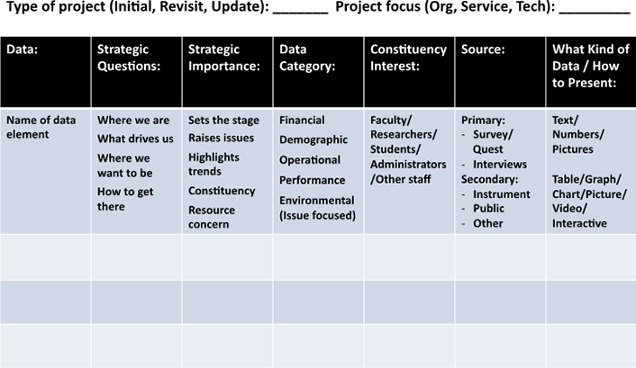
Figure 3. Strategic planning data organizing matrix
Data characteristics to consider include:
- The strategic question the data support (current state, future driver, future state, and implementation)
- The data’s strategic importance (current state, raises issues, highlights trends, distinguishes constituencies, presents resource concern)
- The data category (financial, demographic, operational, performance-related, external environment, descriptive)
- The constituency most interested in the data (faculty, students, administration, etc.)
- The data’s source, including primary (collected for the current study), secondary (previously collected), and external (public databases)
You can create a spreadsheet with data items as rows and these characteristics as columns to classify each; you can then look for “holes” in your data and decide whether you need to find data with other combinations of characteristics. Figure 4 shows an example.
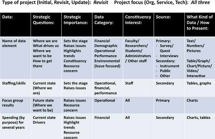
Figure 4. Strategic planning data-organizing matrix example
Strategic Planning Example
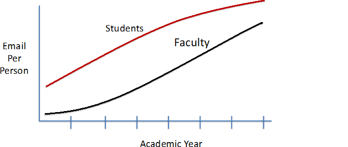
Although it may soon be relegated to the “oldies but goodies” list as we move to cloud services, a favorite topic of strategic planning committees has been how best to provide email services to an institution’s various constituencies. Which data are needed to make that discussion most productive? Current usage and cost data are obvious choices, but industry trends and other projections are also useful. The following example shows how these data types can raise issues for discussion. To simplify, we’ll focus on usage data for students and faculty only (see table 1).
Table 1. Usage data — emails per month per person over a five-year period
| Group | 2013 | 2014 | 2015 | 2016 | 2017 |
|---|---|---|---|---|---|
| Students | 1,500 | 1,700 | 2,000 | 2,200 | 2,350 |
| Faculty | 700 | 800 | 925 | 1,100 | 1,250 |
The first question to ask is whether these data are well defined. For example, does “year” refer to a calendar year or an academic year? (Here, we’ll assume it’s an academic year.) Does “students” include full-time, part-time, residential, nonresidential, and online students? The list of such questions goes on, and a full data definition should answer all such questions — before they are asked.
Now let’s look at the data table itself. Plotting the table data, as in figure 5, offers another view and more information. We can clearly see from the data table that students send and receive approximately double the number of emails as faculty and that the number of emails has grown significantly each year for both groups. Is this what we expected? If so (or not), why (or why not)? What does it say about student and faculty communication behavior? Further, if we look more closely at the table (or simply look at the plot in figure 5), we can see that student emails seem to be leveling off, while faculty emails are still growing, although even that growth is slowing. This raises questions as to what is going on and whether it shows a trend that will continue or even accelerate in the future. These are clearly issues to explore further, perhaps by collecting additional data.
If we collect additional data — say, of social media posts — we might find an explanation for the slowing growth in email (see figure 6). In fact, the social media plot would be off the charts for most students! Adding data on social media postings could make the common issue of what is happening to student–faculty communication on campus even more of a concern (given faculty reliance on email!), perhaps one requiring a specific survey. Assuming the posited change — that students are increasingly using social media in place of email — is true, are faculty members noticing this shift in their students’ communication habits (“students don’t even read most emails from me anymore”)? Should faculty be encouraged to use social media in addition to (or in place of) email? What does the increasing use of social media for on-campus communications mean for the IT department, given that it doesn’t have anything to do with the social media platforms that students use? Also, what does this mean for resources and the types of people IT must deal with if issues occur? Other factors — such as the integrity, security, and availability of communications — all need to be discussed.
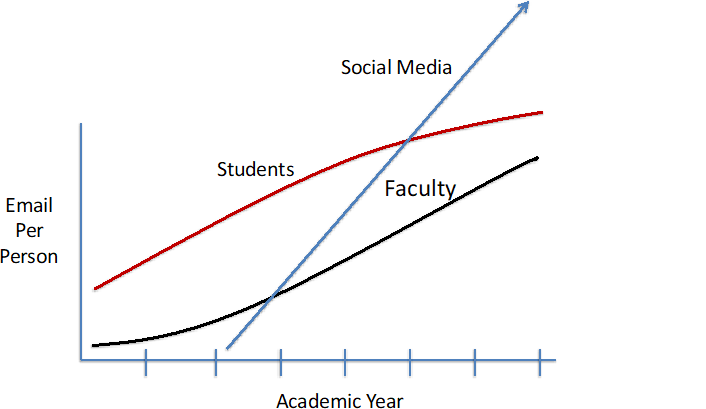
As this example shows, presenting data about the current state (number of emails) by constituency (faculty and students), and factors influencing the future (trends in email versus social media use) can lead to fruitful strategic discussions about where campus communication is headed and what IT will need to do to support it. Filling in the data-organizing matrix (figure 7) also highlights some missing data (financial information, for example) that can be added to further the analysis. This simple example also demonstrates the value of presenting data in multiple forms — here, a table and plot, but there are of course many other options.
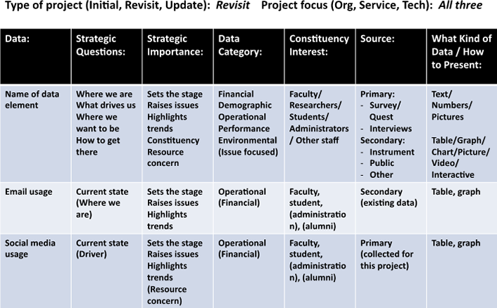
Figure 7. Strategic planning data organizing matrix for the email/social media example
Strategy and Systematic Planning
Successful IT strategic plans result from discussions of a broad variety of issues related to the future provision and use of IT services. These discussions are based on a thorough understanding of the current state, industry and technology trends, and related information.
Ensuring that appropriate data are available to the strategic planning committee for these purposes requires a systematic approach to identifying, defining, collecting, analyzing, organizing, and presenting strategic planning data.
Recent Comments