Microsoft Power BI is a great tool to create Business Intelligence reports, and it includes several high-quality charts and visuals. In addition to the built-in charts and visuals, there are more than 170 custom visuals you can download for free from the integrated marketplace or from the AppSource.
Not sure how to pick the right visuals for your reports among all these resources?
This reference aims at guiding you in that decision.
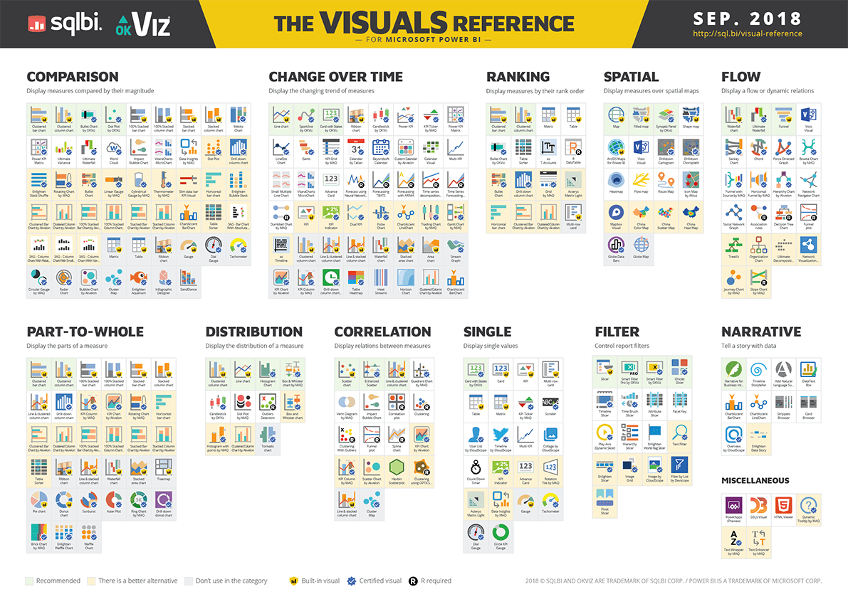
We analyzed all the 204 visuals available on Sep. 2018, assigned them to various categories, and printed the result in a downloadable PDF file. The legend allows you to identify built-in visuals, certified visuals (What does it mean?), and visuals requiring an R environment. Furthermore, for some of the visuals we indicated better alternatives within the same category.
Here are the categories we picked out:
Comparison – To compare the magnitude of measures
Change over time – To display the changing trend of measures
Part-to-whole – To identify the parts making up a measure total
Flow – To display a flow or dynamic relations
Ranking – To rank measures in an order
Spatial – To display measures over spatial maps
Distribution – To display the distribution of values
Correlation – To show correlations between measures
Single – To present single values
Narrative – To tell a story with data
Filter – To control report filters
Miscellaneous