
A well-designed chart should be easy to read and understand, and should not mislead. Here’s how to be an educated data consumer
Know the elements of charts
Ask questions
Watch for misleading or confusing charts
When viewing charts, pay attention to the following items, as they are susceptible to design choices that mislead readers. Here are three examples.
Bar charts with an axis not including zero (0)-An axis without a zero can be misleading on a bar chart, as it can distort the scale of differences between categorical data.
Colour confusion-Color is an effective tool for drawing attention to or differentiating areas of data but can cause confusion if not used carefully. For example, we usually associate density in maps with a darker colour, but if the author reverses the colour range, that can be confusing, and even misleading.
Wrong chart type for the data-Not all chart types work for the selected dimensions and measures.
Charts are the most effective and readable when matched to the right data and purpose.
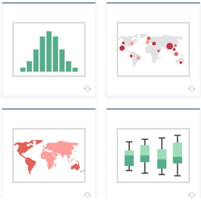
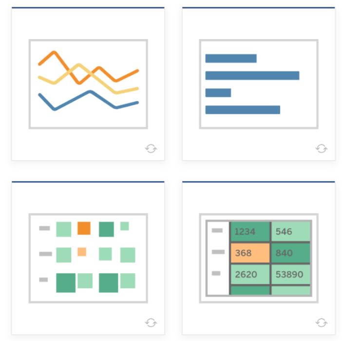
- Line — View trends in data over time.
Examples: Stock price change over a five-year period or website page views during a month. - Bar — Compare data across categories.
Examples: Volume of shirts in different sizes, or per cent of spending by department. - Heat Map — Show the relationship between two factors.
Examples: Segment analysis of the target market or sales leads by individual rep. - Highlight Table — Shows detailed information on heat maps.
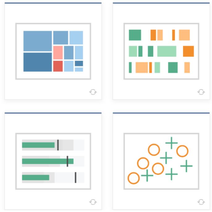
Examples: The per cent of a market for different segments, or sales numbers in a region. - Treemap — Show hierarchical data as a proportion of a whole.
Examples: Storage usage across computer machines, comparing fiscal budgets between years. - Gantt — Show duration over time.
Examples: Project timeline, duration of a machine’s use, availability of players on a team. - Bullet — Evaluate the performance of a metric against a goal.
Examples: Sales quota assessment, performance spectrum (great/good/poor). - Scatterplot — Investigate relationships between quantitative values.
Examples: Male versus the female likelihood of having lung cancer at different ages, or technology early adopters’ and laggards’ purchase patterns of smartphones. - Histogram — Understand the distribution of your data.
Examples: Number of customers by company size, student performance on an exam, frequency of a product - Symbol maps — Use for totals rather than rates. Be careful, as small differences will be hard to see.
Examples: Number of customers in different geographies.defect. - Area maps — Use for rates rather than totals.
Use a sensible base geography. Examples: Rates of internet-usage in certain geographies, house prices in different neighbourhoods. - Box-and-Whisker — Show the distribution of a set of data.
Examples: Understanding your data at a glance, seeing how data is skewed towards one end, identifying outliers in your data.

Recent Comments