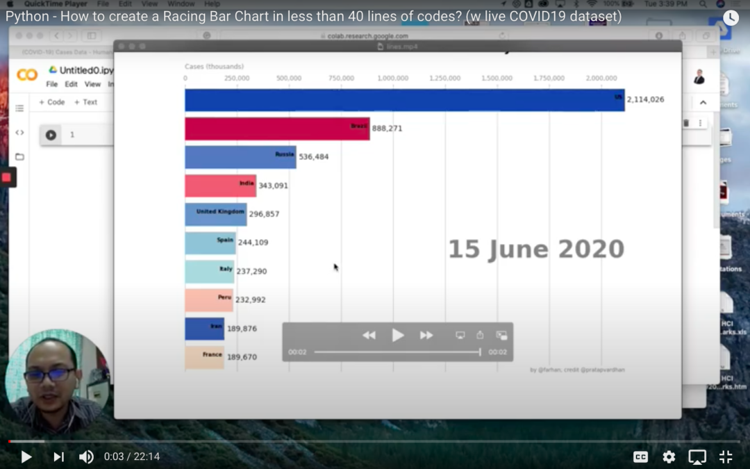
I created the following racing bar chart tutorial months ago in showing how anyone can create, animate and gain insight from a live data and an animated chart.
If you run the codes, it is horrified to see that the coronavirus threat is worryingly becoming worse in parts of the world and moving from one region to another.
Following are the tutorial video (which you can follow step by step on how to create the chart) and the colab file link (in the video description – for those who want to run it straight from the google colab).