Bengkel Focus Group Discussion (FGD) for SUK Selangor Disaster Risk Reduction

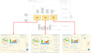
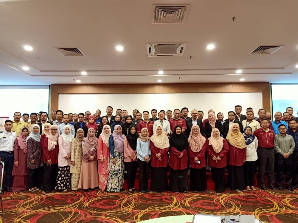
Alhamdulillah, dengan kerjasama SUK Selangor dan Selangor Disaster Management Unit (SDMU), sebanyak 56 agensi yang terlibat hadir untuk FGD. Kajian ini adalah merupakan sebahagian element bagi Geran UTM-RDR 8.1. Big Data Analytics Framework Towards Strengthening Disaster Risk Reduction.

Antara tujuan bengkel ialah untuk mengenalpasti data-data yang ada dan diperlukan untuk membuat unjuran bagi mengurangkan risiko bencana di negeri Selangor. Selain itu, adalah penting untuk memahami proses kerja dan wishlist bagi mengurangkan risiko bencana.

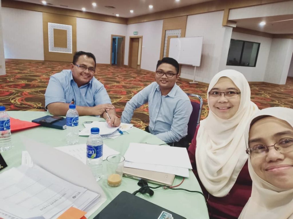
Bersama dengan Mdm Yazriwati Yahya, Team 3 bersama ADO Klang dan Tok Penghulu Pulau Indah banyak insight yang dikongsi bersama. Baru kami faham tentang kepentingan SDMU sebagai unit fokus membantu menyelesaikan bencana.

Credible Journal for Visualization

  1. Journal of Visualization (Springer, If: 0.97)
  1. https://www.journals.elsevier.com/visual-informatics/
  • Visual data acquisition and modelling
  • Visualization and visual analysis
  • Expressive rendering
  • Augmented reality
  • Natural interface based on visual perception
  1. Information Visualization journal http://journals.sagepub.com/home/ivi
  • Scopus – IF 0.923
  • The scope of the journal includes, but is not limited to:
  • Design theories and methodologies
  • Applications and case studies
  • Perception and cognitive factors
  • Evaluation and usability studies
  • Interactive data exploration
  • Standards and visualization languages
  • Multidimensional and multivariate analysis
  • Knowledge discovery and visual data mining
  • Requirement engineering and task analysis
  • Visual Analytics
  1. VISUAL COMPUTER – WOS Q3
  2. COMPUTER GRAPHICS FORUM
    • COMPUTER SCIENCE, SOFTWARE ENGINEERING 22 of 104 Q1
  1. IEEE TRANSACTIONS ON VISUALIZATION AND COMPUTER GRAPHICS (TVCG)
    • COMPUTER SCIENCE, SOFTWARE ENGINEERING 8 of 104 Q1
    • IEEE Vis conference : http://ieeevis.org/ Its the principal conference on computational methods for data visualization, and it is subdivided intro three sub-conferences :
      1. Conference on Visual Analytics Science & Technology (VAST)
      2. Conference on Information Visualization (InfoVis)
  • Conference on Scientific Visualization (SciVis)
  1. HUMAN-CENTRIC COMPUTING AND INFORMATION SCIENCES
    • COMPUTER SCIENCE, INFORMATION SYSTEMS 64 of 148       Q2

8.  International Visual Informatics Conference 2019 (IVIC ’19)

https://link.springer.com/conference/ivic

http://ivic.org.my/wp/paper-submission/

See the collective work of the Management Visualization Society at www.ma-vis.com

Rationales for the Big Picture Selection

I got a constructive comment from ICIMU, the reviewer suggests to provide the rationale for visualization selection from custom BI. The rationale will help the potential reader to develop understanding – why such structures was chosen and why they are appropriate to represent the selected data/information or to be used for specific area/context.

The answer is actually I still don’t have any answer/rationale for that. Insya Allah, the comment help me to develop for it.

The big picture  = An Overview concept

  1. Metaphor – I am reading surah Az Zumar this morning, ‘perumpamaan’/metaphor/analogy use repeatitively in Al Quran to help human develop better understanding.
  2. Flow – In Sofware Engineering, workflow is widely used to show the process.
  3. Notion of Overviwe – Hornbaek, 2011
  4. Eppler (2007) Periodic table of visualization
  5. The Big Picture by Mengis and Eppler 2007 – 2012

From Periodic table, there are various field of visualization:

  1. Data Visualization includes standard quantitative formats such as Pie Charts, Area Charts
    or Line Graphs. They are visual representations of quantitative data in schematic form
    (either with or without axes), they are all-purpose, mainly used for getting an overview of
    data.” An example of student work (pie chart and bar chart).
  2. “Information Visualization, such as semantic networks or treemaps, is defined as the use of interactive visual representations of data to amplify cognition. This means that the data is transformed into an image; it is mapped to screen space.
  3. Concept Visualization, like a concept map or a Gantt chart; these are methods to elaborate (mostly) qualitative concepts, ideas, plans, and analyses through the help of rule-guided mapping procedures.
  4. Metaphor Visualization, like metro map or story template are effective and simple templates to convey complex insights. Visual Metaphors fulfill a dual function, first they position information graphically to organize and structure it.” As an example, temple diagram which required the student to extract all components of complexity from the chapter to create a concise summary
  5. Strategy Visualization, like a Strategy Canvas or technology roadmap is defined “as the
    systematic use of complementary visual representations to improve the analysis,
    development, formulation, communication, and implementation of strategies in
    organizations.”
  6.  “Compound Visualization consists of several of the aforementioned formats. They can be
    complex knowledge maps that contain diagrammatic and metaphoric elements,
    conceptual cartoons with quantitative charts, or wall sized info murals. (Note: The
    Periodic table is a Compound Visualization)” 6,7 Figure 6 shows an information
    (timeline) and compound (graphic facilitation) visualization summarizing a chapter of the
    book The Science of Formula 1 Design.

Visualization uncertainty – 2017 new trend

According to Catherine, there are five design strategies for creative data literacies for empowerment.

1. Work with community centered data

2. Make the data looked messy – of course I agree with this one – perceived finishedness and modifiability concept have been mentioned by Hundhausen and Bresciani.

3. Write data biographies

4. Build learner centered tools

5. Favor creative outputs over Tuftean purity.

Watch the talks from Catherine D’Ignazio to understand more in https://vimeo.com/181697718


Visualization Venues and their ranking.

Good reading from eagereyes.org. Thank you Robert Kosara for an eye opener on visualization venues. Further details can find from https://eagereyes.org/blog/2013/a-guide-to-the-quality-of-different-visualization-venues Here, I summarized the venues based on their ranking.

1st Rank: TVCG, VAST, InfoVis, SciVis, EuroVis, CHI

Consider as top tier venues are:

Journal

Conference

  • IEEE VIS – VAST, InfoVis, SciVis. All the papers are published in TVCG.
  • EuroVis. At par with VIS, EuroVis. All papers are published in CGF.
  • SIGGRAPH. According to Kosara, if you have a visualization technique that produces stunningly beautiful images, you can give a SIGGRAPH submission a shot. More than likely, it’s a waste of time, though. If you get it in, it’s a big deal however, and you join the very exclusive club of visualization researchers with SIGGRAPH papers.

Second rank: InfoVis Journal, CG&A, VIS Symposia, PacificVis

The second tier are not quite as good as the above, but are still solid venues to get work published.

  • The Information Visualisation Journal (abbreviated as IVS, IVI, or IV Journal) is a more recent journal that still seems to be struggling for attention. Paper quality is more mixed than in TVCG, though they are also more focused on information visualization.
  • Computer Graphics and Applications (CG&A) is a magazine published by the IEEE that is more application-oriented and geared towards a broader audience. It’s a good place for systems papers and applications in general. Papers get rewritten for readability and there are some restrictions on the number of citations, etc.
  • IEEE VIS doesn’t just consist of the three conferences, but also of a few symposia. This year, those included LDAV (Large Data Analysis and Visualization), BioVis (bioinformatics data visualization), and VizSec (security visualization). I wasn’t excited by LDAV last year, and I didn’t attend this year. BioVis is a great effort that brings together visualization and bioinformatics researchers. I don’t know anything about VizSec. But these are good venues to talk to a more specialized audience and to explore topics that aren’t covered enough in the conferences.
  • PacificVis technically has a good acceptance rate, but I haven’t seen many exciting papers published there. It also seems more focused on scientific visualization, so it’s a bit outside my general awareness horizon.

There are also a number of other small conferences and symposia that aren’t core visualization venues, but that can be interesting for certain work. Those include User Interface Software and Technology (UIST)Advanced Visual Interfaces (AVI), the Diagrams Conference, etc.

3rd rank: IV, VIS workshops, VDA, WSCG

Lower tier means high acceptance rate and generally low quality, but they can still be worthwhile to get master’s thesis work published, etc. The point is to know what to expect, both when reading a paper from such a conference, and when submitting work there.

  • International Conferences in Central Europe on Computer Graphics, Visualization and Computer Vision (formerly Winter School of Computer Graphics, WSCG). If you work in visualization, you’re probably getting the barrage of emails from Vaclav Skala each year about WSCG. The conference has a high acceptance rate, but it’s also a good opportunity to travel to Plzen (which the Pils is named after) and see work from Eastern Europe that you wouldn’t otherwise see. Also, at what other conference are you handed two bottles of beer with your name badge when you register?
  • Visualization and Data Analysis (VDA) is a small conference with a high acceptance rate (48% in 2012) that is part of the SPIE Electronic Imaging Conference. This could be a really solid little conference, but being tied to a large conference that has nothing to do with visualization (and that is quite expensive) doesn’t do it any favors. Though if you go, you’ll be able to just skip over to Human Vision in Electronic Imaging (HVEI), which is a solid little perception and vision conference.
  • Workshops at VIS. While they are associated with a high-quality conference, the limited audience and late deadline for these workshops usually means that they don’t get a lot of submissions (and those are often rejected conference submissions). So the overall quality is just not as high. The focus on a narrow and potentially overlooked topic can still make them worthwhile, though.
  • A British company called graphicslink organizes a conference confusingly named Information Visualisation (commonly referred to as IV), with a number of associated conferences, one of which is called ViS. It is usually held in London, but also travels around Europe at times; next year, it will be held in Paris. The quality is generally very low and the scope includes anything that has to do with pixels, either generating them or analyzing them. Avoid.

Overview and Details in viewing Dashboard.

The concept of Overview and Details has been long introduced by Schneiderman 30 years back through visualization mantra. At that time I am form five at Sekolah Menengah Sains Muar 🙂

“Overview First, Zoom and Filter, then Details on demand”

Then after 30 years, we found the overview concept has been taken as the big picture. But the function for overview to cover the big picture concept is still inadequate. That’s why we need to extend the overview – by relating to its details and more importantly emphasized the interconnectedness between these elements.

To custom current BI tools, we tried to apply these concept by proposing the design below:

By proposing this layout, we intend to facilitate the challenge 1 that we shared from previous posting.

Interconnection within custom visualization

I am using BI Power Tools with custom visualization to develop this (please refer to the overview diagram)

Initially, I’ve found three challenges:

  1. How to embed the interconnectedness (see the lines with red dotes) within these customize visual diagrams?
  2. Putting flow to ease the cognitive understanding.
  3. Tracing the specific information when going to the deeper level ( filter) – in which the current dashboard will go to different pages.