Mount Ophir, or Gunung Ledang as it is famously known, is a rite of passage for many hikers in Malaysia. Its challenging trails and breathtaking summit view make every step of the journey worthwhile. But after the hike is over, how do you relive the experience? How do you analyze your performance and see the mountain from a new perspective?
Today, we’re excited to launch a new tool designed for every Mount Ophir enthusiast: the Mount Ophir Hiking Analyzer. This interactive web application, now live at https://dev.kstutm.com/mtophir/, transforms your raw GPX data into a beautiful, insightful, and shareable dashboard.
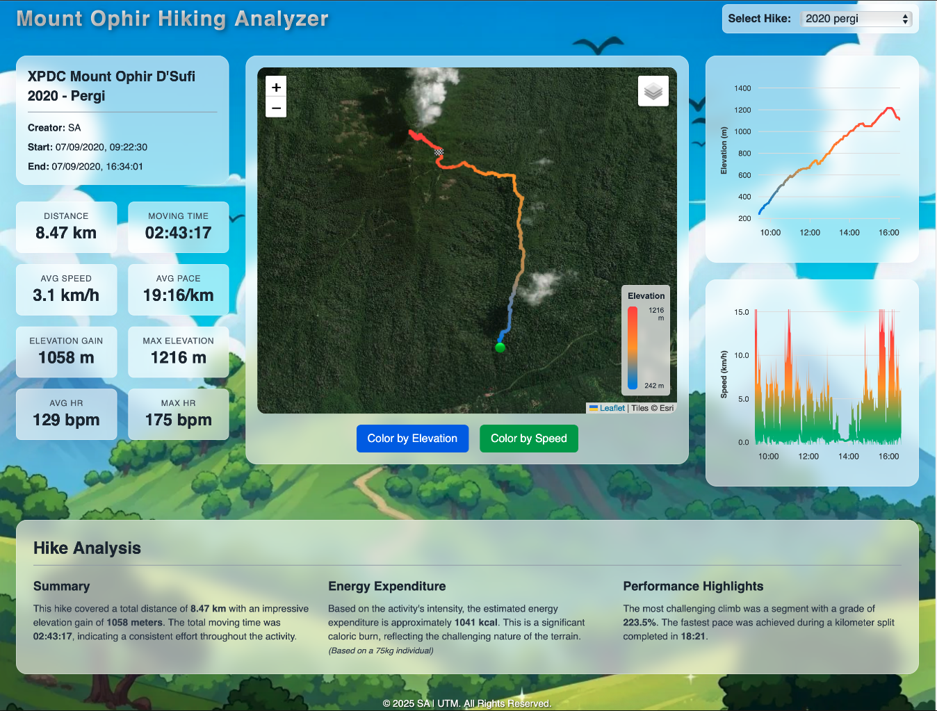
A Dashboard as Stunning as the View
The first thing you’ll notice is the stunning “light glass” interface, designed to feel modern and clean. The main dashboard gives you an immediate overview of your hike’s most important statistics. At a glance, you can see your total distance, moving time, elevation gain, average pace, and even your average and max heart rates if your device captures them.

The main dashboard provides a clean, at-a-glance summary of your hike.
Interactive Map: Your Hike, Your Way
The centerpiece of the analyzer is the interactive map. Your hiking track is beautifully overlaid on a detailed map, which you can switch between Terrain, Street, and Satellite views.
But it gets better. You can instantly color-code your track by elevation or speed. This feature allows you to see exactly where the steepest sections of your climb were or where you managed to pick up the pace.

Toggle between different basemaps and color-code your route by speed or elevation to gain new insights.
Synced Charts: Connecting the Dots
Below the map, you’ll find detailed charts for your elevation and speed profiles over time. These charts are not just static images; they are fully interactive. As you move your cursor over the graphs, a marker will appear on the map, showing you the exact geographical point corresponding to that moment in your hike. The tooltip also provides crucial data like the distance traveled at that point. This synchronized view is incredibly powerful for pinpointing exactly where you faced challenges or hit your stride.

The elevation and speed charts are synchronized with the map for a comprehensive analysis.
Get a Deeper Story with Hike Analysis
Beyond the raw numbers, the analyzer provides a comprehensive textual summary of your adventure. This section gives you a narrative of your hike, estimates the calories burned during your trek, and highlights your key performance metrics, such as your steepest climb and your fastest kilometer.

The Hike Analysis section provides a narrative summary and performance highlights.
Whether you’re a seasoned hiker looking to analyze your performance or a beginner wanting to visualize your amazing accomplishment, the Mount Ophir Hiking Analyzer is the perfect companion.
Ready to see your hike in a whole new light?
