Data Quality Dimensions – Issues, Challenges and Possible Solutions from Pharmaceutical Company Case Study

Mas Munirah Master Project Supervision

Mas Munirah is an independent student. I think sometimes she is too independent when she is solo traveling to Japan, Bali and frequent Temerloh-KL. Working at Pharmaniaga, one of the prominent pharmaceutical company in Malaysia, she is intends to do research on something that will contribute back to the company – hence, she picks this topic.

Predicting Mental Illness among High School Students in Malaysia.

Based on National Health Morbidity Survey 2017 (NHMS 2017) by the Health Ministry’s Institute for Public Health (IPH) 2017, high school students in Malaysia are at risk for mental health problems. The results from the studies show that 18.3% high schoolers are suffering from depression, 39.7% have anxiety and 9.6% dealing with stress.

This is a master project by Aizat Nuruddin. He is predicting Mental Illness among High School Students in Malaysia. Using Data from National Health and Morbidity Survey (NHMS 2012). Hopefully the symptoms and factors identified can help alarming the situation.

https://youtu.be/lnfeuFanmmo

AS104 Remote Supervision

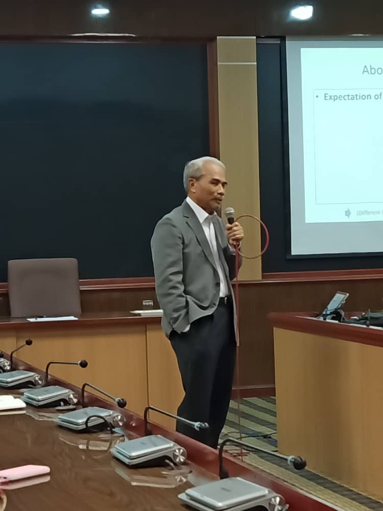
Prof Emeritus Datuk Ir Dr Zainai Mohamed talks about AS104 – Remote Supervision at Bilik Ilmuan 1, UTM KL. Thank you SPS for arranging this session. It is superpower brain food to hear from 69 years old wise man talks about effective supervision.

Key things (foundation to understand)

  1. Research – original investigation undertaken in order to gain knowledge and understanding. These include curiousity-lead activity and work of direct relevance to the needs of commerce and industry.
  2. Scholarship – generates outputs generate
  3. Level of higher degree awards
    1. Bsc Degree Project need approx 300-400 hours with fairly demanding on level of difficulties.
    2. Master Degree -600-900hours
      1. Master Project
      2. Dissertation
      3. Thesis
    3. Doctor of philosophy – orginality and make some significant contribution to knowledge at least some of which might be publishable later.
      1. minimum of 5400 hours.

Part 1: Supervision & Effective Supervision
Supervision must be able to develop research and scholarship capability. The purpose of supervision (why):

  1. Share knowledge and experience.
  2. Guide and facilitate the students to produce research and result product.
  3. Enhance the student research skills
  4. To monitor the students within his/her study timeline. – GOT is extended monitoring – ensure the student ended at proper time.
  5. To motivate the students during ups and downs – not necessarily provide the solution since the motivation is itself the solution. Simple discussion, sooth them, connect them to the right people or resources is also part of the motivation.
  6. To facilitate research process – clarify the path for research process flow – in the reasonable scope.

Effective supervision with respect to processes.

  1. First of all, for effective supervision – we must know which level of degree award we supervise. e.g. for PhD, it is about supervised research training. Don’t expect the student to deliver all of your expected outcomes.
  2. In AS104, we are handling the student that intend to solve the real industry problem – Hence we need to carefully identify the reasonable scope and limit for this kind of situation. No need to solve the whole world, department of ministry problem within one phd.
  3. Develop partnership with the student. It is not only one time meeting. It is the partnership from the beginning until the end.

Expected Outcomes

  1. Scholarship thinking.
  2. Produce student with good discipline in academics
  3. The findings of the students research should contribute to the well being of society
  4. Develop research Culture and environment – and develop the culture will take sometimes.
  5. Develop Expertise within body of knowledge.

Part 2: Remote Supervision & Responsibilities of Participants
Remote means off campus programmes – at UTM we have: UTM Pesisir, special program, Open Distance Learning (ODL) Franchise PG Program (SPACE).

  1. Remote location & External student.
  2. Confidence in sutdent’s independency within agreed environment
  3. Insfrastructure – library, lab
  4. Expertise
  5. Quality assurance elements.

Take home message from Prof Emeritus Dato’ Dr Zainai to empower the supervision. 

  • Don’t kill the student’s ideas – accommodate the ideas.
  • We are busy, but when it comes to students’ time – don’t show them we are too busy.
  • Supervision is about to develop the scholarship thinking and personal abilities. To do these will take some time and partnership. Share, discuss and grow the knowledge together.

Student Supervision – Meeting 5 2018

Meeting No 5 for Semester 2 2017/2018
Date : Thursday 1st March 2018
Venue : Dr Suraya Ya’acob Room, 7.30.01, Level 7, MJIIT, UTM-AIS KL

1. Nurul Hawani – Not Applicable
2. Norazilah – Not Applicable
3. Sharifah Izora – PHD Tahun 3 (semester 5) Defer this semester – 4 pm
4. ZairulAsraf – Msc Informatics Projek 2 ( Final Submission: 14 May) – Lunch Hour
5. Khairunnisa – Msc Assurance Projek 2 ( Final Submission: 14 May) Crucial* 10am
6. Raja Norhaida – Msc Assurance Projek 2 ( Final Submission: 14 May) Crucial* – 230pm
7. Jennifer – Msc BIA Projek 2 (Final Submission: 14 May)
8. Sharida Chan – Msc BIA Project 1 ( Final Submission: 14 May) – 2.30pm
9. Mesam – MANA Project 2 ( Final Submission: 14 May) Crucial* 3:30 pm

Students’ Progress Supervision attendance

Students’ Progress Supervision

Utilizing Tableau Free Software for students

If you’re a student looking to land an internship or your first full-time job, you probably know that companies are looking for people with data skills. But they’re not just looking for any data talent—they’re specifically looking for people who know how to use Tableau. In fact, Tableau was recently listed as the third fastest growing technical skill in demand.

You’ve taken the first step in joining the community of over 100,000 students who are using Tableau each year! Now that you have your free license, you can begin learning these valuable skills that will help you land a job. Here are three steps to help you navigate the beginning of your Tableau journey:

1. Learn Tableau

The first step to being successful with Tableau is learning the tool itself. Recent grad Matt Atherton states, “Start with tutorial videos – first the Getting Started video on Tableau’s website. When you’re watching these, think about how to visualize your own data”. This short 25-minute video will provide you with an overview of Tableau Desktop from start—connecting to data—to finish—sharing your completed visualizations.

Once you’ve gotten the lay of the land, you can dive deeper into specific functionality with the Starter Kits and on-demand training videos on our website. As a student, Lynda.com is also a great resource, since many schools have subscriptions that allow for free access. Search for Tableau and you’ll find hundreds of videos and courses, many created by experts in the Tableau community.

Speaking of our community…

Our community is part of what makes Tableau so unique. Not only is our community active on our user forums, they also create a bunch of great training content. Check out the Tableau Reference Guide created by one of our Zen Masters, Jeffrey Shaffer.

2. Get inspired and start practicing

Once you start learning the functionality of Tableau, the next step is finding data you want to analyze. We’ve compiled a list of free data resources to help.

Another great way to find data is to check out the viz gallery on Tableau Public. Once you find an interesting viz, many authors allow you to download the workbook (simply click on the download icon in the bottom right-hand corner of the viz). From there, you can reverse engineer the viz to see how the author created it. Or, you can use the data to create your own viz. Here are a few of my favorite vizzes:

That’s not all. Makeover Monday, currently run by Tableau Social Ambassador Eva Murray and Tableau Zen Master Andy Kriebel, is a great way to start honing your data viz skills and get involved in a broader conversation about and with data. Each week a link to a chart and its data is posted online. Your task is to rework the chart and then share it on Twitter. This is a great way to engage with the Tableau community and get feedback on your work. And if that’s not enough, take your Tableau skills to the next level with Workout Wednesday.

3. Share your work

Once you’ve started created your own vizzes, don’t forget to publish them to your Tableau Public profile to start your data portfolio (learn how to do that here). A great example of this is Corey Jones’s profile. He started his data portfolio while he was a student at Saint Joseph’s University. Once you’ve published a few vizzes, you can add your Public profile link to your resume and LinkedIn profile to showcase your skills to future employers and get a leg up on the competition.

I wish you the best of luck on the start of your Tableau journey and can’t wait to see what you create. Don’t forget to enter your viz into our student contest for a chance to win Tableau swag. If you don’t yet have a free student license, request yours today!

learn more from here: https://public.tableau.com/en-us/s/blog/2017/09/3-steps-make-most-your-free-student-license
Predictive Analytics vs Business Intelligence

According to tibco (2017), flat dashboards (err… most probably, they are referring to BI) are killing analytics. When it comes to data visualization technologies, most vendors offer similar insights, along with graphing and storytelling functionality. What you most often see are screens with two or three panels that have a nice looking graph or two. If you click on the graph or adjust the controls, the visualization may change. It’s not bad. You can explore simple data sets, usually those stored in a spreadsheet table. You get fast results. You might even apply a statistical function or two. These dashboards are fundamentally fat. If you had magic virtual reality glasses and could pull the dashboard of the screen and look at the way it was made, you might see an inch or two of data and analytics behind each panel. If you want to change the data used or adjust the analytic, you go back to the spreadsheet or to the statistics package that calculated the analytic.

Flat dashboards provide a limited amount of insight. Usually, when fat dashboard technology is used in a company, it becomes a form of reporting, offering static information. The result is a proliferation of low-value visualizations that analyze small sets of data for individuals or groups. In a typical company, there could be hundreds or thousands of these low-value reports, which leads to a management and maintenance nightmare. Furthermore, because reports are uncoordinated, ad-hoc, and based on tiny slices of whatever-data-is-on-hand, they often lack a level of correctness and completeness, which canlead to incorrect conclusions and business mayhem. The old adage “garbage in, garbage out” too often applies to fat dashboards.

http://www.olspsanalytics.com/predictive-analytics-vs-business-intelligence/

Temporal Data and Weather Forecast

Weather data is temporal data. It changes according to time (hours, day, month or years). Since weather is crucial for us human to do our activities, people forecast it. By having forecast data, it helps business and people plan for their outdoor activities. In Malaysia – it is very crucial during kenduri kahwin, some people still believe and hire ‘bomoh hujan’ to forecast and prevent rain during the wedding day. More over, it helps business plan like transportation, construction and farmers for crop irrigation and protection. Eventhough the weather data in Malaysia is not as crucial as in four season country (since it will not help people on how to dress or either to bring extra coat for windy days) but forecast data can help in term of health issue like asthma and heat stress especially for children’sschool activities.

Since the data for Forecast weather is everywhere – from your own handphone, PC, TV and radio. I think for Haida (since you are from MANA – assurance course), it is time for us to check the accuracy between the forecast data and the real one. It will help to prove the accuracy of Jabatan Meteorologi Data. If the comparison has been done, why dont we visualize the comparison to ease the forecast data understanding.

Thus, the objectives for Haida research can be something like this

  1. Compare between forecast and real set of weather data.
  2. Visualize the comparison
  3. Identify the accuracy of the forecast data – reliability/assurance of the data OR maybe we can access how people trust/ the data?  (hmm.. this can give awareness about the credibility of jabatan meteorologi data)

In order to do that, what you need to do this week is:

  1. Identify and get the forecast and real set of weather data (try to get a set for 10 days first)
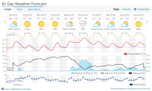
    1. Type of data – the general one, things like this:

Source: weather underground weather forecast.

  1. Bring that set of data for our next discussion (17 August 2017).
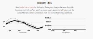
  2. Have a peek on your expected outcomes, something like this (but not necessarily exact):

  1. Read and understand this http://stat4701.github.io/edav/2015/03/25/hafiz-weather-1/very good to get some ideas for your LR (please explain to me your understanding about this article in our discussion later)